
Build a Notion Project Status Report Template
A project status report template is your team's single source of truth. It’s a standardized way to share a project's progress, flag risks, and give everyone a clear picture of its overall health. When done right, it keeps everyone from your core team to key clients on the same page about milestones, budget, and timelines.
Why Old-School Status Reports No Longer Work
Let's be honest: most project status reports are DOA—dead on arrival. They’re static documents, usually a spreadsheet or a Word file, that get sent out and immediately buried in a sea of emails. This old-school approach often creates more confusion than clarity.
Traditional templates just can't keep up. A report you write on Monday is already missing critical updates by Tuesday morning, which means people are making decisions based on stale information. This creates frustrating communication silos, where different stakeholders are working off different versions of reality.
The Problem with Static Information
The real killer here is the administrative drag. Project managers waste countless hours chasing down updates, plugging data into cells, and fiddling with formatting—only to do it all over again the next week. That’s valuable time that could be spent actually solving problems, not just reporting on them.
This isn't just an annoyance; it has a real impact. Research shows that teams using structured project status reports can see up to a 28% increase in project delivery success rates. Better visibility into milestones and risks is what makes the difference. On top of that, a good template can slash the time it takes to create these reports by 30-40%. If you want to dig into the numbers, you can find more data on project reporting efficiency over at coefficient.io.
This is where a dynamic project status report template built in a tool like Notion changes the game. It creates a living, breathing document that’s always current and accessible to everyone who needs it.
By shifting from a static document to a live dashboard, you transform reporting from a reactive chore into a proactive management tool. It's no longer just about documenting the past; it's about shaping the future of the project in real time.
Traditional Reports vs Dynamic Notion Templates
To really see the difference, let's break it down. The old way of doing things just doesn't compare to a modern, integrated approach.
| Feature | Traditional Template (Excel, Word) | Notion Template |
|---|---|---|
| Data | Static; outdated immediately | Real-time; always current |
| Accessibility | Buried in emails or local drives | Centralized and cloud-based |
| Collaboration | Difficult; requires version control | Seamless; built for teamwork |
| Integration | Manual data entry from other tools | Can be linked to other databases |
| Time Investment | High administrative overhead | "Set it and forget it" structure |
Ultimately, a dynamic Notion template turns a passive reporting document into an active project hub.
The image below really drives home the different components, update cadences, and audiences a modern reporting system has to serve.
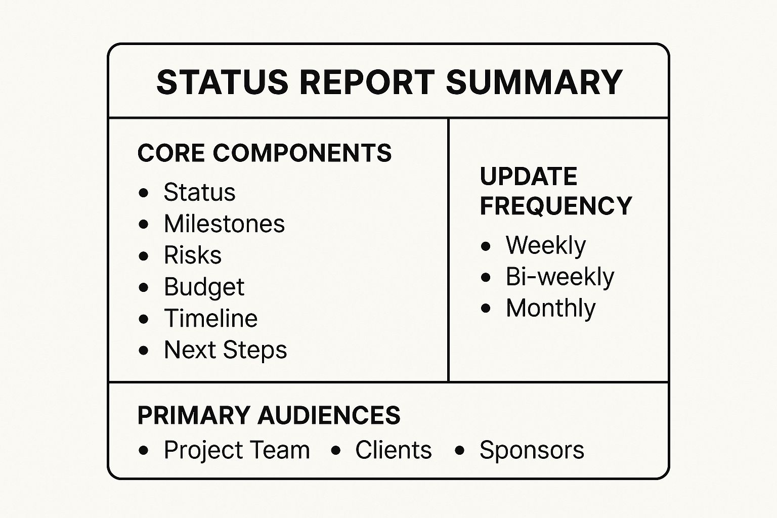
As you can see, a solid template needs to be flexible enough to speak to different people in different ways—something a static document just can't do well. By building your system in an environment like Notion, you create one central hub that works for everyone.
Setting Up Your Core Projects Database
Alright, this is where the real work begins. The secret to a killer project status report in Notion isn't some fancy document—it's a solid, well-thought-out database. Think of this as the command center for all your projects. It's the single source of truth that will feed every report and dashboard you create from here on out.
Building this database is your first concrete step away from juggling scattered spreadsheets and digging through endless email chains. Instead of information living in a dozen different places, every important detail for every project gets a home right here, all organized and ready when you need it.
Defining Essential Properties
First things first, create a new full-page database in your Notion workspace. The "properties" you add are basically the columns that will define how you track everything. You could go wild and add dozens, but I've found that starting with just the essentials keeps things clean and actually usable.
Here are the four properties I consider non-negotiable for any projects database:
- Project Name (Title Property): This is the default main column in any new database. It's simply the unique name for each project, like "Q3 Marketing Campaign" or "New Website Launch."
- Status (Select Property): This one is huge. Use a
Selectproperty to create a handful of clear, standardized stages. Think "Not Started," "In Progress," "Blocked," and "Completed." This ensures everyone is speaking the same language. - Timeline (Date Property): Add a
Dateproperty and make sure you enable the "end date" option. This gives you a clear start and end for each project, which is critical for scheduling and seeing what's on the horizon. - Project Lead (Person Property): Every project needs an owner. The
Personproperty lets you tag the team member who is ultimately responsible for seeing it through. No more confusion about who's in charge.
These four properties are the skeleton of your entire system. You can always flesh it out later with things like 'Priority' or 'Department,' but keeping it simple at the start makes it much more likely your team will actually use it.
I’ve seen so many people over-engineer their database from the get-go with way too many properties. My advice? Start with the absolute essentials. You'll get a much better feel for what other information you actually need once your team starts living in the template.
Configuring Properties for Maximum Impact
Just adding the properties isn't enough; how you set them up is what turns a boring list into a dynamic dashboard.
Take your Status property, for example. Don't just stick with Notion's default gray tags. Give them some life! Assigning colors makes the whole thing instantly scannable. A simple system like green for "On Track," yellow for "At Risk," and red for "Blocked" lets you spot trouble from a mile away.
This simple setup is the first step toward building something much bigger. If you're looking to go beyond just a status report, our guide on project management dashboard templates is packed with ideas for creating a complete command center.
What you're really doing here is building a scalable foundation. This core database won't just hold a list of your projects; it's going to be the engine that powers the dynamic charts and visual dashboards we’ll build later with Widgetly. Getting this structure right from the start makes everything that follows so much easier.
Designing Your Project Update Template Page
Now that you have your main projects database set up, it's time to get into the details that make a status report genuinely useful. We're going to design the standardized layout for each individual project page. Creating a consistent project status report template is the secret sauce to making sure every update—no matter who writes it—delivers the same clear, scannable information.
This isn’t just about aesthetics; it’s about creating a predictable structure that saves everyone a ton of time. When your stakeholders know exactly where to find the high-level summary or the latest risks, they can get what they need in seconds. We’ll lean on Notion's built-in template feature to pre-populate this structure, effectively turning a blank page into an easy-to-use, fill-in-the-blanks report.

As you can see, Notion templates are incredibly versatile. You're essentially creating a reusable asset that project managers can deploy with a single click, bringing instant consistency to your reporting.
Crafting the Core Sections
Let's build the template itself. Head into your main projects database, click the small dropdown arrow next to the blue "New" button, and hit "+ New template." This gives you a blank canvas where you'll build the universal layout for every project. The goal here is to guide the person filling it out, making it almost effortless for them to provide the right information.
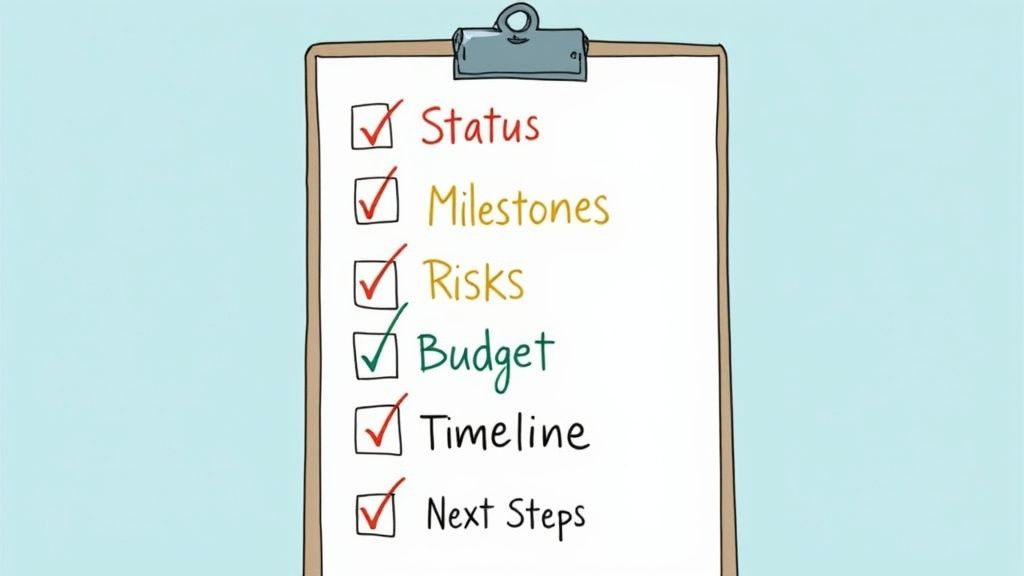
From my experience, these are the essential sections to include:
- High-Level Summary: Start with a simple text block at the very top. This is for a quick, two-sentence overview. Is the project on track, at risk, or totally blocked? What’s the single most important thing stakeholders need to know right now?
- Key Accomplishments This Period: I find a bulleted list or a series of checkboxes works best here. This section should detail what the team has actually completed since the last update. Focus on tangible outcomes, not just busywork.
- Upcoming Priorities: Another bulleted list is perfect for outlining the main focus for the next reporting period, whether that's the next week or the next sprint. It sets clear expectations for what's coming down the pike.
- Risks and Blockers: This is arguably the most critical part of any status report. I always use a callout block for this section to make it pop visually. This is where the project lead flags anything that could threaten the timeline, budget, or scope.
My biggest tip? Use H3 headings and dividers to create clear visual separation between these sections. The cleaner the layout, the faster someone can scan the report. Don't make your stakeholders hunt for information.
Adding Structure and Context
Beyond these basic text blocks, you can really level up your template with more dynamic elements. For instance, if you manage detailed project timelines, why not embed them directly into your updates? You can get some great ideas on how to do that by checking out our guide on Notion calendar templates.
Another pro-move is to add placeholder text within each section to guide the user. Under "Risks and Blockers," you could add a prompt in light gray text like, "Describe any current or potential issues. What is the impact, and what is the mitigation plan?"
This small detail makes a massive difference. It removes any guesswork and helps your team members write far more effective, actionable updates.
Once you save this template, anyone creating a new project in your database can select it, and the entire pre-formatted page will instantly appear, ready to be filled out. This simple step is the key to achieving true consistency across your entire project portfolio.
Adding Dynamic Charts with Widgetly
Alright, you've built the foundation. Your database is solid, and the project page template is ready for consistent, text-based updates. But let's be honest—rows of data and blocks of text don't grab attention. To create a report that people actually want to read, you need to tell a visual story.
This is where we turn that static data into a living, breathing dashboard. Think colorful charts and progress bars that show what’s happening at a glance. It’s one thing to read that a project is "On Track," but it’s another to see it represented in a clean, visual format. For this, we'll bring in a fantastic tool called Widgetly. It hooks directly into your Notion databases and translates that raw data into professional, auto-updating visuals.
This is the step that elevates your project status report from a simple document to an interactive command center.
Connecting Your Data to Visuals
First things first, you need to get Notion and Widgetly talking to each other. Don't worry, you don't need to be a developer for this. After creating a Widgetly account, you'll simply authorize it to access your Notion workspace. You can be specific and only grant it permission to see the projects database you just built.
Once they're connected, you can build your first widget. Let’s imagine you want a quick visual on overall project health. You’d pick a chart type—a donut chart works great for this—and point it to your projects database. Then, you just tell Widgetly to group the data using your "Status" property. It instantly does the work, counting how many projects are "On Track," "At Risk," or "Blocked" and displaying it in a neat chart.
The real magic here is that these charts are not static images. When someone on your team updates a project's status from "On Track" to "At Risk" in the Notion database, the chart embedded in your report updates in real time. No more manually updating graphics!
This live connection is what makes the report so powerful. It builds trust because stakeholders know they’re looking at the absolute latest information, not a snapshot from yesterday.
Choosing the Right Visuals for Your Report
Not all data is created equal, and the same goes for visuals. The key is to pick a widget that makes the underlying numbers immediately understandable. A single metric in a table can get lost, but a visual tells a story.
There's good reason to focus on this. A survey of project managers found that over 78% pointed to standardized reporting as a major factor in keeping projects on time and on budget. And teams that used templates with built-in risk and milestone tracking? They saw 32% fewer instances of scope creep. Visualizing that data just amplifies its impact. You can read more about the findings on project status templates from Smartsheet.com.
To give you some ideas, here’s a quick look at some of the most impactful widgets from Widgetly and how you can use them in your own report.
Key Widgetly Visuals for Your Status Report
| Widget Type | Best Used For | Example Metric |
|---|---|---|
| Pie/Donut Chart | Showing parts of a whole, like status distribution. | Projects by Health Status ("On Track," "At Risk," "Blocked"). |
| Progress Bar | Tracking completion toward a single, key goal. | Overall Portfolio Progress (% of projects marked "Done"). |
| Bar Chart | Comparing values across different categories. | Budget vs. Actual Spend for each active project. |
| Line Chart | Showing a trend or change over a period of time. | Number of completed tasks per week. |
This table is just a starting point. The best approach is to think about the questions your stakeholders always ask and find a visual that answers them instantly.
Here are a few more practical examples you could build:
- Overall Progress Bar: Hook this up to your database and have it calculate the percentage of projects with the "Completed" status. It’s the perfect high-level KPI for executives.
- Task Distribution Pie Chart: If you have a separate task database linked to your projects, you can create a chart showing the workload for each team member.
- Budget vs. Actuals Bar Chart: For projects where you track financials, a simple bar chart comparing "Planned Budget" against "Actual Spend" is incredibly clear.
You don't have to build everything from scratch. You can find a ton of pre-configured options when you explore the available charts for Notion from Widgetly.co.
Once you've designed your chart, Widgetly gives you a simple embed link. Just copy that link, paste it into your Notion report, and choose "Create embed." Your dynamic, data-driven visual will pop right into the page, ready to bring your report to life.
You've built a fantastic project status report template. That's a huge first step, but it’s only half the job. The real test—and honestly, where a lot of these efforts fall flat—is getting your team to actually use it. A perfect template that gathers digital dust is just a pretty failure.
This is where you need to switch from a builder's mindset to a leader's. You need a simple rollout plan that makes this new process feel like a helpful upgrade, not just another piece of administrative busywork. The goal is to weave this report right into your team's natural workflow until it becomes second nature.

Establish a Clear Reporting Cadence
First things first, get rid of any ambiguity. It’s the biggest killer of new habits. You need to decide on a reporting frequency that genuinely fits your project's rhythm and then make sure everyone is on the same page. Is this a weekly check-in every Friday morning? Or maybe a bi-weekly summary at the end of each sprint?
Here are a few cadences I’ve seen work well:
- Weekly Reports: This is the sweet spot for most active projects. It keeps everyone in the loop without creating a ton of extra work for the team.
- Bi-Weekly Reports: If you're running longer-term projects with fewer daily shifts, this often aligns perfectly with a two-week sprint cycle.
- Monthly Reports: This is best for those high-level updates for clients or executives who just need to see major milestones and the overall budget health.
Whatever you land on, make it non-negotiable. A consistent rhythm is what builds the habit and makes reporting a predictable part of everyone’s week.
My best advice is to focus on outcomes, not just activities. Encourage your team to write updates that answer the question, "What did we achieve?" instead of "What were we busy with?" This shift in mindset makes the reports far more valuable.
Set Up Your Notion Sharing and Permissions
With the process locked in, it's time to manage who can see and do what. Notion’s sharing settings are your best friend here. Not everyone needs the same keys to the kingdom.
Your project leads, for example, will need full editing access to fill out their reports. On the other hand, an executive or a client probably just needs a "read-only" view of a high-level dashboard. This simple step prevents accidental edits and keeps the data clean while giving everyone the transparency they need.
Get specific with your permissions:
- Full Access: Give this to project managers and core team members who are responsible for updating the content.
- Can Comment: Perfect for stakeholders who need to ask questions or give feedback directly on the reports.
- Can View: Use this for a wider audience, like the whole company or external clients, who just need to stay informed.
By managing these settings thoughtfully, you make sure the right information gets to the right people without causing confusion or compromising your data. It’s a small detail that makes a massive difference in turning your template into a trusted source of truth for the entire project.
Questions That Always Come Up
Building the perfect Notion template is one thing, but getting your team to actually use it every day is a whole different ballgame. Once you start living in your new system, you'll inevitably run into a few common hurdles. Let's walk through some of the questions I hear most often.
It’s the classic problem: how do you get everyone to fill out their updates consistently? Without a gentle nudge, even the most beautifully designed report can get lost in the shuffle of a busy week.
How Can I Nudge My Team to Fill Out Their Updates?
Notion doesn't have a built-in "send a reminder every Friday" button for database pages, but you have a few really solid workarounds. The simplest is to use a Date property and just set a reminder manually. It's a quick and dirty solution, but it gets the job done.
If you want true, hands-off automation, you'll need to look at a third-party tool like Zapier or Make.com. You can set up a simple workflow that automatically pings the "Project Lead" on Slack every week with a direct link to the project page they need to update. It removes all the friction.
There's also a clever way to handle this entirely within Notion. I've seen teams create a separate "Team Tasks" database. In it, they'll set up a recurring task like "Complete Weekly Status Report" and then use a Relation property to link it straight to the project in question.
Can I Use This Template to Track Project Budgets?
Absolutely. In fact, this is where your status report starts to become a truly powerful, single source of truth. The most direct way to do this is by adding a few new properties right into your main projects database.
It's as easy as adding:
- Budget: A Number property for the total project budget.
- Actual Spend: Another Number property for the running total of what you've spent.
- Remaining: A Formula property with a simple formula—
prop("Budget") - prop("Actual Spend")—to see what's left in the tank.
For really detailed financial tracking, I highly recommend a separate "Expenses" database. You can log every single expense, from software subscriptions to contractor fees, and link each one back to the main project with a Relation. This gives you both the 30,000-foot view of budget health and the ground-level details.
What’s the Best Way to Show This to My Boss?
Execs and leadership don't have time for the nitty-gritty. They need a bird's-eye view of how the entire portfolio is doing, and they need it fast. The best approach here is to build them their own dedicated dashboard page in Notion.
On this new page, you'll want to drop in a Linked View of your main projects database. This is a game-changer because it lets you display the exact same data but in a totally different way.
Set up this new view as a Board, and group it by the "Status" property. Instantly, you have clean columns for "On Track," "At Risk," and "Blocked." From there, just filter out any completed projects and tweak the card properties to show only the essentials: Project Name, Project Lead, and maybe a key Widgetly chart showing the progress percentage. It creates a powerful, scannable dashboard they can check anytime without getting lost in the weeds.